ResearchDesign & everyday information
When color cannot
carry the message.
A red dot, a blue line, a highlighted box. Color can draw the eye—but the meaning needs another way through.
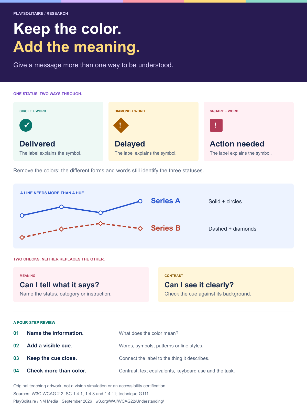
Keep the color.
Add the meaning.
The difference between seeing a signal and knowing what it says.
Three colors.
What do they mean?
The words still work in one ink.
Color + words + distinct forms = more ways to understand.
Imagine a delivery update with three colored dots and no status words. The colors are easy to notice. Their meaning is another question: is amber a delay, a warning or a parcel still in transit?
Now imagine the same screen without dependable color differences. The problem has two parts: readers need to distinguish the signals, and they need to understand what each signal means. A shape helps with the first. A clear label helps with both.
W3C’s Use of Color guidance asks that color not be the only visual means of conveying information. It explicitly welcomes color when another visible cue carries the same information. This is a reason to add meaning, not to drain a design of personality.
01 / TAKE ONE SIGNAL AWAY
What survives when the colors become identical?
Try the same three parcel updates with and without labels and shapes. “Single ink” replaces all three status colors with the same shade. Switch off the extra cues, then bring them back.
Same parcels. Different clues.
The parcel statuses stay fixed. Only their presentation changes.
Colors, shapes and words identify all three statuses.
A diamond and a square are different, but neither inherently means “delayed.” That meaning still needs to be explained. For this display, the words do the decoding; the shapes give another way to distinguish the categories.
Familiar symbols can do similar work. In Spider Solitaire 2 Suits, the two suits are spades and hearts. The printed ♠ and ♥ identify the suit as well as the usual black and red colors. Someone who knows the symbols has a second way to tell those suits apart.
02 / MAKE THE CONNECTION EXPLICIT
A line can have a name, a pattern and a marker
A chart should not make “the blue line” the only way to identify a series. In the example below, Series A is solid with circles; Series B is dashed with diamonds. Each line also ends beside its name.
Follow the form, not just the hue
Completed tasks across four days. Values demonstrate chart design; they are not research findings.
View the example’s values as a table
| Series | Day 1 | Day 2 | Day 3 | Day 4 |
|---|---|---|---|---|
| Series A | 2 | 5 | 4 | 8 |
| Series B | 1 | 3 | 6 | 5 |
The table is another route to the exact values. A text description can also explain the chart’s main point. W3C’s guidance on complex images recommends both a short identification and a fuller text equivalent for information-rich graphics. Adding visible labels does not replace that work.
03 / COUNT THE MEANINGS
Two colors cannot name four suits
Sometimes the color code loses information even when every shade is easy to distinguish. In a conventional four-suit deck, red covers hearts and diamonds; black covers spades and clubs. The color names the family, not the individual suit.
2 color families. 4 distinct suits.
Read the symbol to recover the distinction that color leaves out.
Same color.
Different suit.
Same color.
Different suit.
That distinction matters in Spider Solitaire 4 Suits: a completed King-to-Ace run must contain one suit. Knowing that every card is red does not tell you whether the run mixes hearts and diamonds. The suit symbols carry information that the color cannot.
The right cue depends on the rule
In Solitaire Turn 1, tableau columns descend in alternating colors, while foundations ascend in the same suit. “Red” helps explain one rule; “hearts” is needed for the other. A useful instruction names the property the reader actually needs to check.
One rank lower.
Black, then red.
One rank higher.
Hearts, then hearts.
04 / ASK TWO SEPARATE QUESTIONS
Can I tell what it means? Can I see it clearly?
A label solves little if it is too faint to read. Color-independent meaning and light–dark contrast are separate checks. One does not prove the other.
A second cue still needs contrast
The faint sample is intentionally hard to read. Both samples say “Your parcel is ready.”
Below 4.5:1 for normal text
#a9b8d4 / #ffffffMeets 4.5:1 for normal text
#2855cf / #ffffffNormal text
WCAG AA minimum for text covered by SC 1.4.3.
Large text
At least 18pt regular or 14pt bold under that criterion.
Meaningful graphics
Relevant visual parts against adjacent colors under SC 1.4.11.
Text contrast guidance includes exceptions, such as logos and inactive controls. Non-text contrast guidance addresses the visual information needed to identify controls, their states and meaningful graphics; it does not require every decorative border to reach 3:1.
05 / A QUICK REVIEW TO KEEP
Give the message a second way through
Name the information
Is this color identifying a category, a status, a series or a rule? Write the meaning in plain words first.
Add a visible cue
Use a label, symbol, pattern or line style that repeats the important distinction. Explain unfamiliar symbols.
Keep the cue close
Put “Delayed” by the parcel and the series name beside the line. Do not make the reader hunt for the connection.
Check more than color
Check contrast and the text equivalent, then try the controls with a keyboard. Test whether people can complete the real task.
The goal is not a less colorful screen. It is a message that still makes sense when color is not enough.
Sources, methods and reuse
This is an explainer based on accessibility guidance, with original illustrations. It is not a new study, a medical simulation or an accessibility certification.
- W3C: Understanding 1.4.1 Use of Color
- W3C technique G111: Using color and pattern
- W3C: Understanding 1.4.3 Contrast (Minimum)
- W3C: Understanding 1.4.11 Non-text Contrast
- W3C WAI: Complex Images tutorial
- WCAG 2.2: Relative luminance definition
All parcel statuses and chart values are invented for teaching. The one-ink view replaces three colors with #475569; it does not model a vision condition. Contrast calculations use the WCAG sRGB formula with the 0.04045 channel breakpoint. The artwork and examples were prepared for this article.
Sources checked September 27, 2026. The reference card and checklist summarize these examples; use the linked W3C documents for the criteria and their exceptions.
Keep the color. Add the meaning.
A visual reference for your next chart, status display or set of instructions.